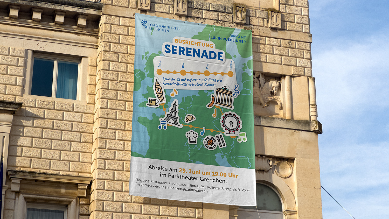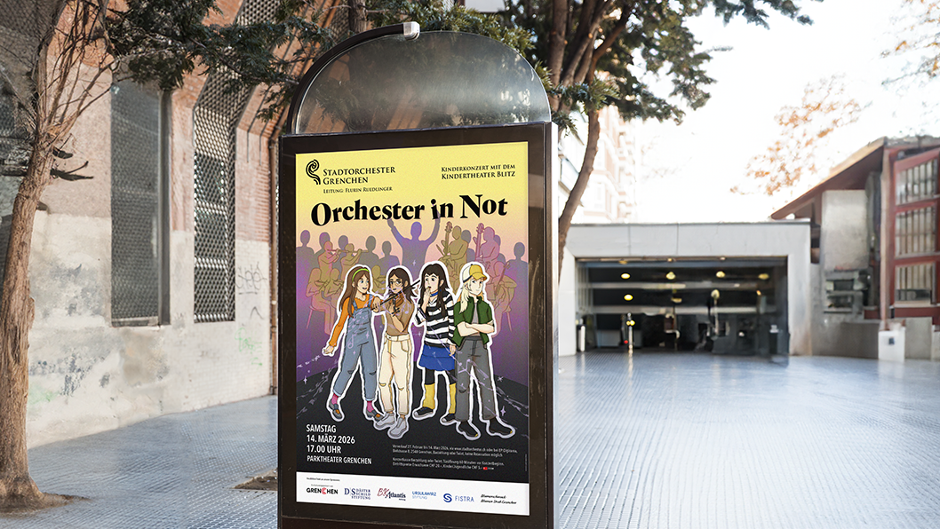
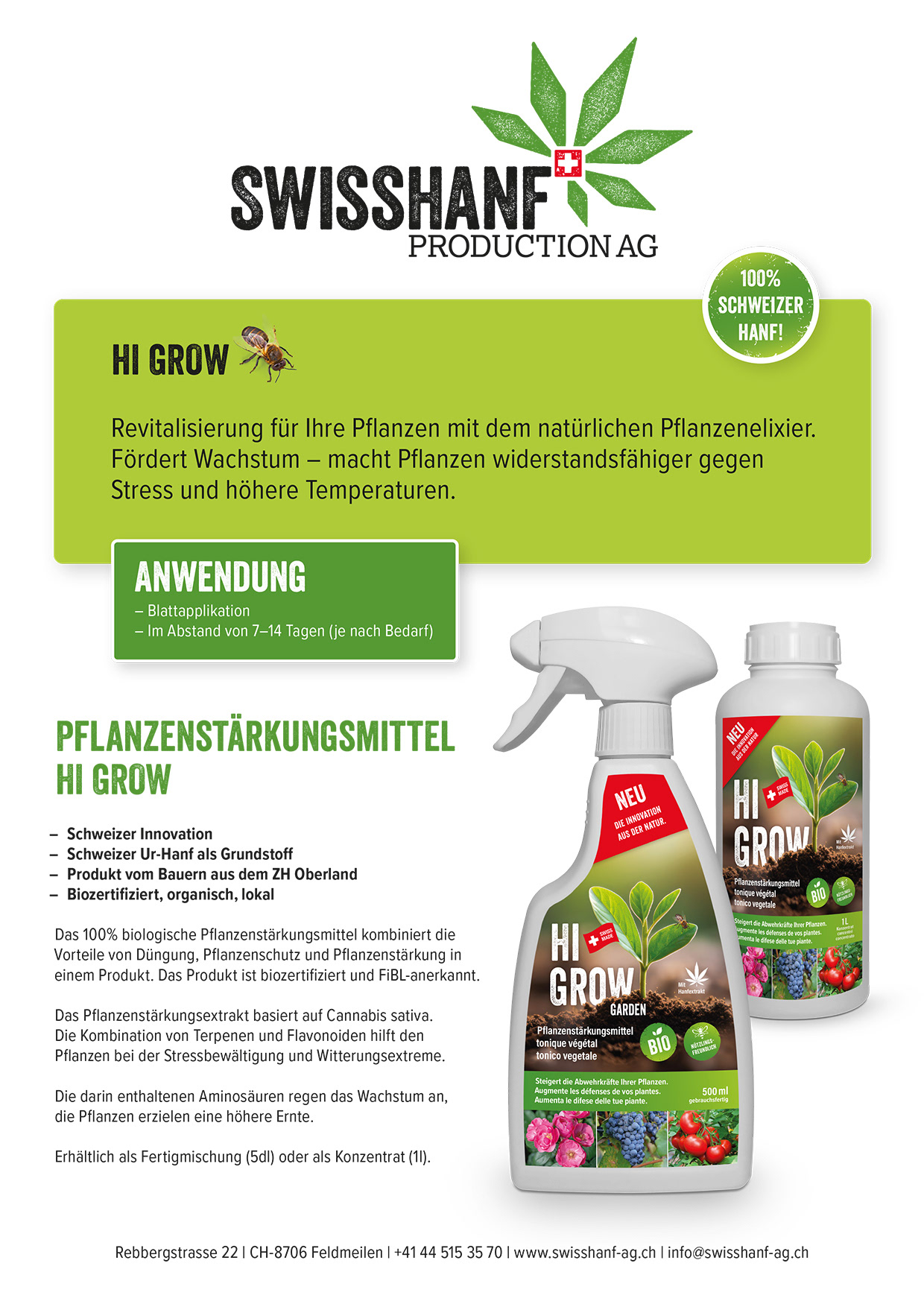
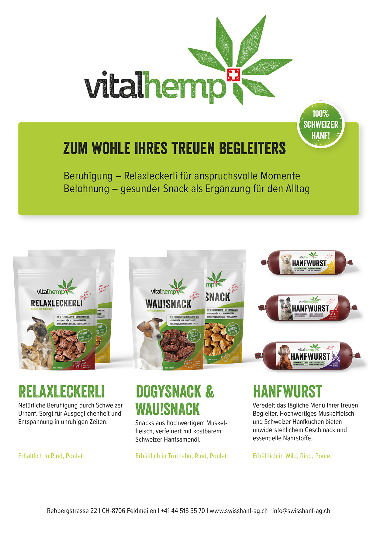
Context
Swisshanf wanted an A4 flyer for their two product lines that they could print themselves or send to potential buyers. While adhering to their corporate design, the product should be readable and appealing.
Swisshanf wanted an A4 flyer for their two product lines that they could print themselves or send to potential buyers. While adhering to their corporate design, the product should be readable and appealing.
My Role
I worked independently on the full design process, from concept development to final print-ready artwork, with feedback from Alois Petraschke, who handled customer communication for this project.
I worked independently on the full design process, from concept development to final print-ready artwork, with feedback from Alois Petraschke, who handled customer communication for this project.
Process
I started by analyzing other designs done for this client and defining common design choices. Usually, I would confide in a CD handbook, which they didn't have. After doing some rough sketches, I jumped straight into InDesign, since this was a straightforward, functional design.
I started by analyzing other designs done for this client and defining common design choices. Usually, I would confide in a CD handbook, which they didn't have. After doing some rough sketches, I jumped straight into InDesign, since this was a straightforward, functional design.
Result
The two flyers are readable and have a strong visual hierarchy. There's still some playfulness with the colours and my usage of the elements from the logos and products, like the bee, for example.
The two flyers are readable and have a strong visual hierarchy. There's still some playfulness with the colours and my usage of the elements from the logos and products, like the bee, for example.
Reflection
This project helped me strengthen my skills in visual hierarchy and color communication. Looking back, I would further test variations of the typography to see how different font pairings could enhance readability.
This project helped me strengthen my skills in visual hierarchy and color communication. Looking back, I would further test variations of the typography to see how different font pairings could enhance readability.